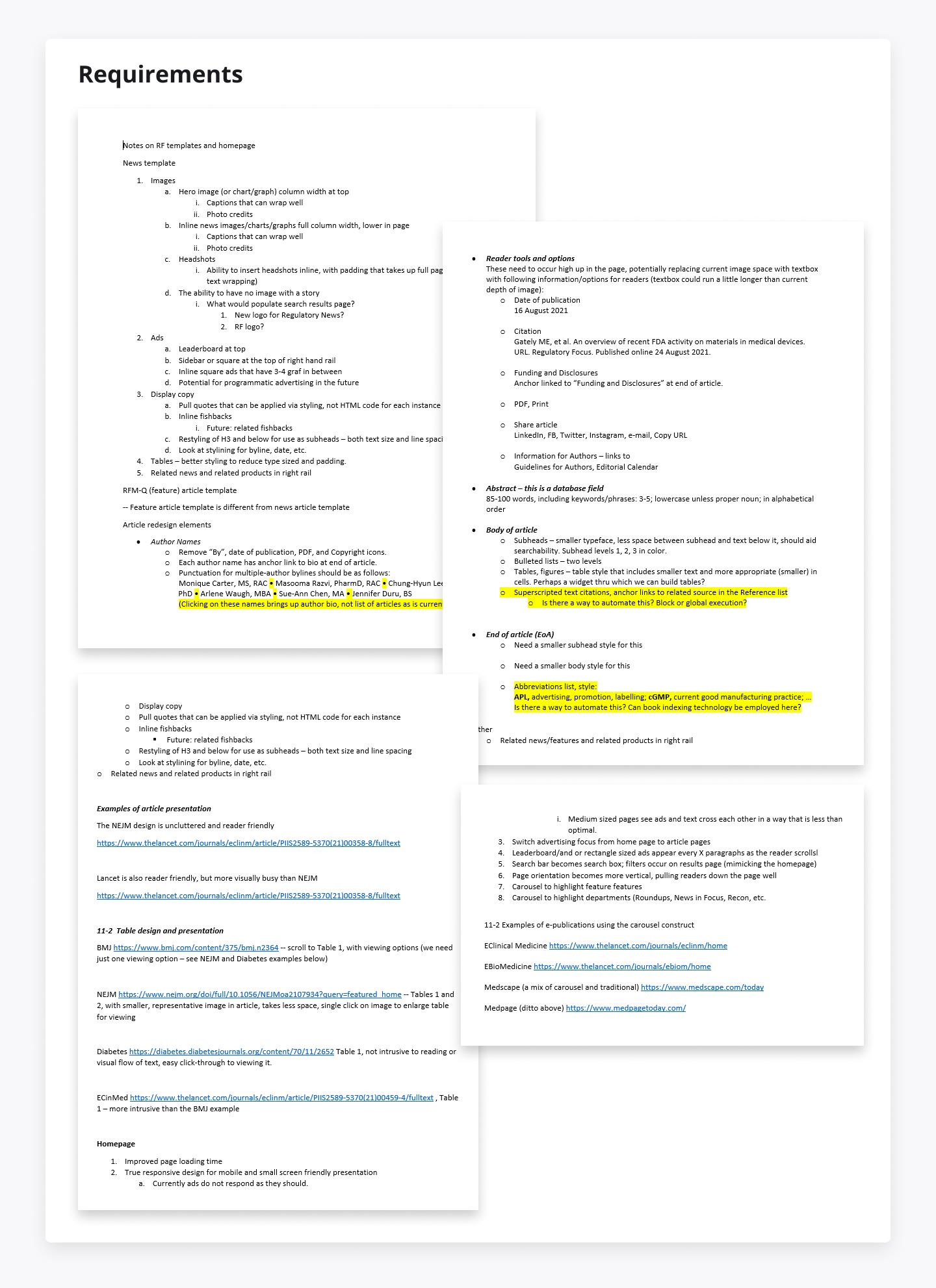
Once upon a time, a non-profit organization named faced a RAPS unique challenge: too many voices competing to capture the attention of their large base of visitors. With numerous stakeholders, each had their own agenda, leading to a cluttered and overwhelming website. It was a classic case of "too many cooks in the kitchen."
Before I joined the project, RAPS had already spent $100k on a firm to redesign their website. But despite the hefty investment, they weren’t satisfied with the results. Sure, the site looked visually appealing, but it wasn’t functional. Visitors were quickly abandoning the site, and no one could figure out why.
That’s when I stepped in. The first thing I did was conduct usability tests to see where users were dropping off. It didn’t take long to identify the problem. Right from the first screen, visitors were overwhelmed with too much information. Each stakeholder was trying to pull the audience into their own corner, making it impossible to focus.
As the new kid on the block, I proposed a simple idea: why not ask the user why they’re there, literally? Instead of bombarding them with information, we added a straightforward question in the first block of the website, asking users about their purpose for visiting.
We ran a test study with this change and saw immediate results. The engagement skyrocketed, and now we had solid, objective proof to take back to the stakeholders. Armed with this data, we were able to bring everyone together around a common goal, despite their competing agendas.
In the end, we achieved something great. By focusing on the user’s needs instead of trying to cater to everyone at once, we increased lead captures by 5%. It was a valuable experience—one that taught me the power of simplicity and how asking the right question can lead to breakthrough results.
Ux / Ui Designer
Web Designer
Jun 2016 — Jan 2022


